

Architectural Isn’t a Style — It’s a Way of Thinking … About Wallpaper
The word architectural comes up often in interior design, especially when describing wallpaper and other surface elements. It’s widely used, but not especially easy to define. In practice, it seems less about style and more about describing the intended role a design plays within a space.
As a surface pattern designer transitioning from a long career in other design fields, I’ve been learning how interior designers use language—and how that language shapes design decisions. Because my current focus is wallpaper, understanding how interiors function has become essential. Along the way, I had an unexpected aha moment that now directly informs how I build and position my collections.
Understanding industry terms like "architectural" helps me define my work, write clearer collection descriptions, and communicate my intent when speaking with art directors. More importantly, it allows me to design with constraints in mind—to create a collection with a specific role and then hold myself accountable to that brief.
The Assumption I Didn’t Realize I Was Making
When I first began developing these patterns, I focused on illustration style. I created many motifs using the same tools and constraints, then began arranging them into patterns somewhat intuitively. What I initially thought would be a single collection, other designers suggested, might work better as two or more separate collections.
At the time, I didn’t fully understand why.
Months later, as I developed two collections back-to-back specifically for wallpaper, I assumed they would serve essentially the same role. They shared a botanical foundation, a similar hand, and a restrained palette. I expected them to be interchangeable in how they were described and presented.
That assumption turned out to be wrong.
Where the Assumption Broke Down
The difference became clear not during design, but during the positioning of the work.
When I tried to write descriptions and imagine where each collection might live in an interior, the language that worked for one felt strained when applied to the other. I found myself forcing similar words onto patterns that didn’t behave the same way once I imagined them in a room.
What I hadn’t accounted for was this:
visual similarity doesn’t guarantee functional similarity—especially in wallpaper, where a pattern’s job is as much about supporting space as it is about expressing form.
A Side-by-Side Comparison
At first glance, my Flutter n’ Fly and Wing & Frond collections feel stylistically similar. But they serve very different purposes.
Flutter n’ Fly is more illustrative. The motifs—stylized florals and butterflies—are clearly identifiable and carry the visual hierarchy of the design. There’s a subtle narrative presence and emotional engagement. In this case, the pattern serves the motif.
Wing & Frond, on the other hand, reads as architectural. It emphasizes rhythm and repetition. The eye reads texture and structure before it reads detail. From a distance, the pattern registers as a surface rather than a collection of individual elements. Here, the motifs serve the pattern, behaving more like material or texture than illustration.
Because these two collections behave differently in space, separating them into distinct collections is not only justified—it’s necessary.
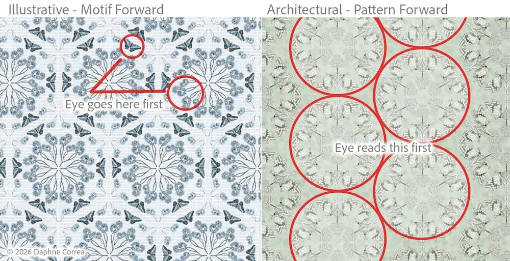
Illustrative<>Architectural patterns - side by side comparison
Why This Distinction Matters
Neither approach is better than the other. The two collections simply serve different roles.
Architectural wallpaper's intent is to:
Sit behind furniture
Scale across a room
Support an interior rather than compete with it
Have a longer commercial life
Understanding this distinction helps me design more intentionally and communicate more accurately when pitching to brands.
A Simple Gut Check for Architectural Wallpaper Design Work
When evaluating whether a collection can function in an architectural role, I now ask:
Would it still work in silhouette?
Does it read as texture from a distance?
Is the structure doing more work than the motifs?
Could it support an interior without competing?
This shift in thinking has been an important step as I bridge illustration and design—creating collections with a clear role and marketable intent. When a design is built with this level of clarity, there’s very little confusion about how it’s meant to be used.